Make S Curve Construction Accurate: WBS, Excel and Six Period Example
Master the S-curve to turn static budgets into early-warning systems. This guide covers WBS alignment, Excel setup, and a worked six-period example for UK builders.
By James Shorter ·
Make S Curve Construction Accurate: WBS, Excel and Six Period Example
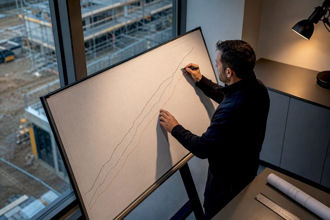
An S-curve is a cumulative, time-phased plot of planned value, earned value and actual cost across a project’s life. It matters because it turns a static budget and schedule into an early-warning system, showing exactly when spend or progress starts drifting off track. Get the inputs right and it becomes the backbone of forecasting and, if things go wrong, of a defensible claim.
TL;DR:
- Divergences between earned value and planned value highlight schedule delays, especially when EV falls below PV during the main build phase.
- When actual costs exceed earned value, the project is overspending relative to work completed, risking margin erosion.
- An unrevised baseline after scope changes produces misleading curves that compare reality against outdated plans, inflating perceived overruns.
- Proper rebaselining after approved variations involves preserving previous baselines and plotting new plans as separate series for transparency.
- Accurate, real-time site data captured automatically reduces reporting lag and enhances the reliability of S-curve insights for project control.
Table of Contents
- What is an S curve in construction project management?
- What data do you need before you start?
- How to build an S-curve step by step
- What does it mean when the lines diverge?
- How do you forecast and rebaseline properly?
- What common mistakes make an S-curve misleading?
- Worked example: building a small S-curve from scratch
- How do S-curves differ across project phases and industries?
- How do schedule changes affect S-curve analysis?
- How should S-curves be used in stakeholder reporting?
- How do S-curves integrate with project management software?
- Practitioner view: keeping S-curves honest week to week
- How BRCKS keeps the data behind your S-curve honest
- Sources
- FAQ
What is an S curve in construction project management?
The name comes from the shape the cumulative curve traces: slow at mobilisation, steep through the main build, flat again at close-out. Three lines matter here. Planned value (PV) is the budget you expected to spend by a given date, taken straight from your time-phased baseline. Earned value (EV) is the budget value of work actually completed, regardless of what it cost. Actual cost (AC) is what you genuinely spent getting there.
Plotted together, these three lines are what turn a chart into a diagnostic tool. When PV, EV and AC diverge, that gap is where the story is. A project running to plan has all three lines tracking closely; a project in trouble shows a widening gap, often weeks before anyone raises it in a meeting.
The S shape itself follows the natural rhythm of a build:
- Mobilisation — slow start, site set-up, early procurement, low spend velocity
- Peak activity — the steep middle section where multiple trades run concurrently
- Close-out — snagging, commissioning and final accounts, spend tapering again
You can plot an S-curve in cost, in labour hours, or in quantities (cubic metres poured, metres of cable pulled), depending on what you’re trying to control. Whichever unit you choose, normalise it to percent complete against the total planned value so different trades and packages sit on a comparable scale.
What data do you need before you start?
An S-curve is only as good as the structure underneath it. Before you plot anything, you need your Work Breakdown Structure (WBS) and Cost Breakdown Structure (CBS) aligned to each other, and to the contract’s payment structure. If your WBS splits work by floor but your CBS splits cost by trade package, every cumulative figure you produce will need manual reconciliation, and manual reconciliation is where errors creep in.
You also need a resource-loaded, logic-linked baseline schedule with a time-phased budget sitting behind it. A schedule with no resources attached tells you dates; it doesn’t tell you spend. AACE’s Total Cost Management framing treats the S-curve as an output of integrated planning, estimating and change control, not a standalone chart bolted on afterwards. If those three processes sit in separate spreadsheets owned by separate people, the curve will lag reality by weeks.
Before you build anything, agree:
- Earning rules for EV (percent complete, milestone, units produced) — and write them down
- Update cadence (weekly is standard on active builds; monthly undersells the risk)
- A version-control approach so each baseline revision is preserved, not overwritten
Run a few sanity checks every period: confirm no cost is captured twice across packages, that reporting periods align across cost and schedule data, and that cumulative totals actually sum to the full contract value.
Pro Tip: Set your earning rules before the first data point goes in, not after the first dispute. A rule agreed retrospectively always favours whoever is arguing loudest.
How to build an S-curve step by step
Building an S-curve in Excel is still the most practical route for most site teams and QS departments, and it scales fine up to a few hundred activities.
-
Pick your cadence and units. Weekly is the standard for active construction; decide now whether you’re tracking cost, hours or quantities, and stick to it for the life of the project.
-
Set up a raw input sheet. Columns should include: reporting period, planned periodic value, actual periodic value, milestone flags, data source, and last-updated date. This sheet is your audit trail — keep it, don’t overwrite it.
-
Build cumulative totals. Running-sum the planned periodic column to get cumulative PV, and the actual periodic column to get cumulative AC. Then calculate percent complete for each period by dividing cumulative actual by the total project budget (the denominator never changes mid-project unless you formally rebaseline).
-
Add an earned value column. Apply your agreed earning rule (percent complete against the schedule, milestone achievement, or units installed multiplied by unit rate) to generate periodic EV, then cumulate it the same way as PV and AC.
-
Build the chart. Use a date-based X-axis, not a period number, so gaps and overlaps show up honestly. Plot cumulative PV, EV and AC as three separate line series, and add your baseline plan as a distinct dotted or dashed series so it stays visible even after updates.
-
Add milestone markers. Scatter points at key dates (practical completion, key handover packages) make the chart readable to someone glancing at it in a board meeting rather than studying it.
-
Format for clarity. Consistent axis intervals, a clear legend, and colour-coding that holds steady report after report. If AC is red this week and blue next week, you’ve lost your audience.
For the mechanics of formulas and chart settings, a detailed Excel tutorial walks through cell-by-cell setup compatible with Excel 2016 through Microsoft 365, and covers milestone scatter formatting in more depth than fits here.
Version control deserves its own line. When a variation gets approved and the schedule shifts, don’t quietly edit the existing baseline series. Preserve the original baseline as a permanent historical reference, and plot the revised plan as a new series alongside it. That way anyone reviewing the chart later can see both what was promised at contract signature and what was agreed after the variation.
A resource-loaded Gantt chart underpins this whole workflow. Without one, your time-phased budget is a guess dressed up as a plan.
What does it mean when the lines diverge?
Reading an S-curve is really reading three relationships between the lines, each with a distinct diagnosis.
- EV below PV means the project is behind schedule. Work that should have been completed by this date hasn’t been. This is a programme problem, not necessarily a cost problem yet.
- EV below AC means the project is over budget for the work actually delivered. You’re spending more to achieve less than planned, which is the combination that erodes margin fastest.
- AC above PV on its own isn’t automatically bad. It can mean spend has accelerated because of front-loaded procurement, or it can mean genuine overspend. Context matters more here than on the other two comparisons.
Two ratios turn these visual gaps into numbers you can act on. Cost Performance Index (CPI) is EV divided by AC; a CPI below 1.0 means you’re getting less value than you’re spending on. Schedule Performance Index (SPI) is EV divided by PV; below1.0 means you’re behind where the baseline said you’d be. Neither threshold is a fixed rule, but many project controls teams treat anything under 0.90 as worth a formal review, purely as a practical trigger rather than a contractual one.
Trend lines add a forecasting layer. If AC has been climbing at a consistent burn rate for the last four to six periods, extrapolating that rate forward gives a rough Estimate at Completion (EAC) and a projected finish date, well before the final account confirms it the hard way. Case-study evidence links exactly this kind of early cumulative deviation to the scope changes and delays behind most cost and time overruns.
None of this works as a chart alone. Pair the visual with the CPI and SPI figures and a short written note explaining why the lines moved this period, because a senior stakeholder scanning a report wants the diagnosis, not just the picture.
How do you forecast and rebaseline properly?
Two forecasting approaches cover most construction projects. Linear trend extrapolation projects the current burn rate forward and suits stable projects with no major upcoming scope changes. Burn-rate extrapolation looks at the average spend or progress rate over the last several periods and is more responsive to recent performance than a straight trend line drawn from day one. On programmes with unusual uncertainty, more advanced probabilistic S-curve techniques exist, using statistical bands rather than single lines, though most residential and commercial builds don’t need that level of complexity.
EAC and TCPI give you the numbers behind the trend. A simple EAC formula is:
EAC = AC + (Budget at Completion − EV) / CPI
This assumes future work continues at the same cost efficiency as work completed so far. To-Complete Performance Index (TCPI) tells you the CPI you’d need to achieve on all remaining work to hit the original budget: TCPI = (Budget at Completion − EV) / (Budget at Completion − AC). If that number is far above 1.0, hitting the original budget is unrealistic and it’s time for an honest conversation, not a hopeful forecast.
When a variation gets approved, rebaselining follows a strict order:
- Confirm the variation through formal change control before touching any curve.
- Preserve the original baseline as a permanent historical series, never overwrite it.
- Log the time and cost effects of the variation against the specific WBS/CBS lines it touches.
- Plot the revised plan as a new series, so the chart shows both versions clearly.
- Record the date and authority of the rebaseline in your project files, not just in an email thread.
Pro Tip: Keep every superseded baseline as its own labelled series in the workbook. If a dispute lands eighteen months after handover, that historical trail is worth more than any narrative you could write from memory.
What common mistakes make an S-curve misleading?
An S-curve that looks fine on the wall and lies in the detail is worse than no chart at all, because it creates false confidence.
- A stale baseline left unrevised after approved variations manufactures a permanent, artificial overrun. If the scope changed and the baseline didn’t, the curve is comparing today’s reality against yesterday’s plan. Audit the baseline at every variation, not just at scheduled report dates.
- Poor earning rules are the second big culprit. If “50% complete” means something different to the site foreman than it does to the QS logging progress, EV becomes fiction. Agree physical measurement rules up front and spot-check compliance.
- Aggregate-only reporting hides package-level problems inside a healthy-looking programme total. A groundworks package running 20% behind can sit invisible inside an overall curve that looks broadly on track, because other packages are ahead. Produce package-level curves alongside the programme view for genuine root-cause analysis.
- Data hygiene errors — misaligned CBS and WBS codes, miscounted reporting periods, and double-counted costs across overlapping packages — quietly corrupt cumulative totals long before anyone notices the trend has bent.
Worked example: building a small S-curve from scratch
A short six-period example makes the mechanics concrete. Assume a total budget of £600,000 spread across six weeks.
- Set the baseline. Planned periodic spend: £80k, £90k, £110k, £120k, £110k, £90k, giving cumulative PV of £80k, £170k, £280k, £400k, £510k, £600k.
- Record actuals. Say actual periodic spend runs £70k, £95k, £120k, £140k, £130k, £120k, giving cumulative AC of £70k, £165k, £285k, £425k, £555k, £675k.
- Apply an earning rule. Using a simple percent-physical-complete rule, assume earned progress lands slightly behind plan: cumulative EV of £65k, £150k, £250k, £370k, £480k, £580k by period six.
- Compute the indices. By period six, CPI = 580 ÷ 675 = 0.86, and SPI = 580 ÷ 600 = 0.97. The project is close to schedule but burning cash faster than it’s earning value.
- Project forward. With EAC = AC + (BAC − EV) / CPI, that’s 675 + (600 − 580) / 0.86 ≈ £698,000, roughly £98k over the original budget.
The one-paragraph narrative to sit alongside this chart: progress is broadly on programme, but cost efficiency has slipped since period three, most likely tied to a specific package. The corrective action is a package-level review to isolate where AC has outpaced EV, not a blanket cut across every trade.
How do S-curves differ across project phases and industries?
An S-curve for early-stage groundworks looks nothing like one for the fit-out phase, and treating them the same way misreads both. During substructure and groundworks, the curve tends to be shallow and erratic, since weather, ground conditions and utility diversions create genuine variability that isn’t a performance failure. Through the structural and envelope phase, the curve steepens sharply and predictably, because multiple trades run in parallel and spend velocity is at its highest. Fit-out and MEP installation often produce a curve with small plateaus, as work waits on inspections, commissioning sign-offs, or sequencing between trades.
Industry context shifts the picture again. Residential builds tend to show a cleaner, more symmetrical S because scope is relatively fixed at contract. Commercial fit-out projects, where scope changes are more frequent through the build, often show a curve that steps sideways each time a variation lands, rather than climbing smoothly. Infrastructure and civils projects, with long procurement lead times on plant and materials, frequently show a flatter early curve than a residential build of similar value, simply because spend doesn’t start moving until major deliveries arrive on site.
None of these variations mean the curve is wrong. They mean the benchmark for “normal” has to be set against the specific phase and project type, not against a generic template. Comparing a groundworks curve against a fit-out benchmark will always look alarming, because the shapes were never going to match.
How do schedule changes affect S-curve analysis?
Every schedule change ripples through the S-curve, and the size of that ripple depends entirely on where in the programme it lands. A slip in an early activity with float absorbs quietly; the curve barely moves. A slip in an activity on the critical path pushes the entire remaining PV line to the right, and if the baseline isn’t updated to reflect that, every subsequent period will show an apparent schedule variance that isn’t really a performance problem at all, just an unadjusted plan.

Approved variations create a similar distortion if handled carelessly. Adding scope without extending the time-phased budget and schedule accordingly means EV has more work to cover with the same denominator, artificially depressing SPI even though nothing has actually gone wrong on site. This is precisely why a frozen baseline left unrevised after a formally approved variation manufactures a permanent apparent overrun that has nothing to do with actual performance.
The practical fix is discipline around timing: rebaseline as soon as a variation is formally approved, not at the next scheduled report date. A two-week lag between approval and rebaseline means two weeks of misleading numbers circulating in reports, and once a client or funder has seen an alarming figure, walking it back afterwards is harder than getting it right first time.
How should S-curves be used in stakeholder reporting?
A chart alone rarely changes a decision; a chart with a one-paragraph narrative usually does. Senior stakeholders need the diagnosis, not just the picture, because a widening gap between EV and AC means little to someone who wasn’t in the site meeting where the cause was identified.
Different audiences need different cuts of the same underlying data. A funder or client typically wants the programme-level curve and a short narrative on overall health. A site manager needs the package-level curves that reveal exactly which trade or activity is driving any deviation. Presenting only the aggregate view to an internal commercial team wastes the detail they actually need to act.
Cadence matters as much as content. Weekly internal updates keep the site team and QS aligned on live figures; monthly stakeholder reports should show the trend across the last several periods, not just the current snapshot, so a client can see whether a dip is a blip or a pattern. Where risk and contingency are material, showing them as a band around the forecast line, rather than a single hard number, gives stakeholders an honest sense of the range of outcomes rather than false precision.
The strongest reports pair the curve with a plain-English narrative: what moved, why it moved, and what’s being done about it. A curve without that sentence forces the reader to guess at causation, and guesses in a client meeting rarely land well.
How do S-curves integrate with project management software?
Most modern construction platforms can generate an S-curve automatically once cost and schedule data are loaded, which removes the manual charting step but doesn’t remove the need for clean inputs. The chart is only as reliable as the WBS/CBS structure and the time-phased budget feeding it, whether that data is typed into Excel or pulled through an integration.
Where software genuinely adds value is reducing the lag between an event happening on site and that event reaching the curve. If a variation is agreed verbally on site on a Tuesday and doesn’t reach the cost report until the following Monday’s meeting, the S-curve is a week behind reality for that whole period. Tools that capture variations, RFIs and progress records at the point of occurrence, rather than at the point of manual entry, shrink that gap considerably.
Integration also matters for traceability. A curve that shows a dip in period nine is far more useful when it links directly back to the site diary entries, photos and decisions from that period, rather than sitting as an isolated image in a monthly report. That link is what turns an S-curve from a static snapshot into part of a genuinely integrated project controls system, in the spirit AACE’s TCM framework describes.
Practitioner view: keeping S-curves honest week to week
S-curves go stale fast when updates depend on someone remembering to type figures into a spreadsheet on a Friday afternoon. The curve is only as current as its weakest data source, and on most sites that’s whoever’s meant to be logging progress against the WBS while also running a trade.
What actually keeps a curve trustworthy is tying it to records that get created anyway: photo-led snag entries, RFIs logged the day they’re raised, variations captured at the point they’re agreed on site rather than reconstructed later from memory. When those records feed the curve automatically instead of through a second manual entry, the lag between reality and report shrinks, and so does the temptation to smooth over an awkward week.
— James
How BRCKS keeps the data behind your S-curve honest
Every fix in this article, tighter earning rules, package-level curves, faster rebaselines, depends on one thing: getting site data into the record before it goes stale. That’s the gap BRCKS is built to close. Instead of variations sitting in a WhatsApp thread until someone remembers to log them, or a snag getting fixed before anyone’s noted it happened, BRCKS captures that activity as it occurs and files it against the right project automatically.

Concretely, that means automatic site diaries built from the messages and photos your team is already sending, structured variation and RFI logs with a full audit trail, and versioned project files so nobody’s arguing over which drawing or RAMS document was current when a decision got made. Teams keep messaging through WhatsApp with a dedicated business number rather than learning a new app, which is what actually gets adoption on site rather than resistance to it. That structured record is exactly the raw material a defensible S-curve needs: dated, attributable, and traceable back to source.
BRCKS costs from £40 per seat per month billed annually, with subcontractors and clients invited free. If your S-curve updates are always a week behind what’s actually happening on site, it’s worth seeing whether tighter data capture closes that gap. Take a look at the construction project management software and see what a 14-day trial shows you.
Sources
For deeper methodology, the PCtrl piece on S-curves and budget drift and the MDPI case study cover AACE/TCM framing and empirical deviation patterns. For hands-on templates, use the Excel tutorial and the SOMA Project Controls critique for common failure fixes.
- Using S‑Curves to spot budget drift in construction
- The S-curve as a tool for planning and controlling of construction process—case study
- Why your S-curve is lying to you · SOMA Project Controls
- Excel tutorial: how to create S-curve in Excel for construction
FAQ
How do you build an S-curve?
Gather your time-phased baseline budget, actual periodic costs, and an agreed earning rule for EV, then compute cumulative totals for each and chart them against a date axis. The full method, including Excel setup, sits in the step-by-step section above.
What is the difference between a Gantt chart and an S-curve?
A Gantt chart shows individual activities, their durations and dependencies on a timeline; an S-curve shows cumulative value, cost or progress as a single trend line over the same period. The Gantt chart tells you what should be happening and when; the S-curve tells you whether the money and progress are actually tracking to that plan.
Can you give an example of an S-curve in construction?
A typical example plots cumulative planned value climbing slowly during mobilisation, steeply through the structural and fit-out phases, then flattening at close-out and handover. The worked six-period example earlier in this article shows the actual figures and calculations behind that shape.
What does an S-curve mean?
An S-curve means the project’s cumulative spend or progress is being tracked against a time-phased plan, with the characteristic S shape reflecting slow mobilisation, a fast middle phase, and a tapered close-out. When the actual line departs from the planned line, that gap is the earliest visible sign of a cost or schedule problem.
How much does BRCKS cost?
BRCKS starts from £40 per seat per month, billed annually, with subcontractors and clients invited free of charge. Current pricing details and available add-ons are listed on the BRCKS pricing page.
Recommended
How BRCKS Can Help
Mastering manual S-curves in Excel provides a vital foundation for project oversight, yet maintaining this accuracy across complex developments remains a significant challenge. BRCKS simplifies this process by automating data integration and WBS tracking, ensuring your progress visualisations stay precise without the administrative burden. By centralising your project controls, BRCKS empowers your team to focus on delivery rather than spreadsheet maintenance. We invite you to explore how our platform can transform your construction management workflow today. Learn more at BRCKS and explore our full feature set.
Sources
- BRCKS - Construction Management Software
- Association for Project Management (APM) - Earned Value Management
- Project Management Institute (PMI) - Work Breakdown Structure Guide
- RICS - Black Book: Financial Reporting in Construction
- CIOB - Code of Practice for Project Management for Construction and Development